Sometimes it feels that a day
doesn’t go by without another author penning another set of rules for
writing. But if I were ever to pin a maxim above my desk, it might not be a writer’s rules, but a graphic designer’s:
Abram Games’ characteristically pithy definition of good design, ‘maximum
meaning, minimum means’.

Who is Abram Games? You may think you’ve never heard of him, but
I’m sure you’ll recognise his posters.
He produced some of the most iconic images of the twentieth century,
from the Festival of Britain logo to the controversial ‘blonde bombshell’ ATS
recruiting poster.

I was drawn to the
centenary exhibition currently on at London’s Jewish Museum because he produced
exactly the kind of war posters which influenced both the cover design and
content of my last two books, ‘A World Between Us’ and ‘That Burning Summer’, and
also because I saw parallels between Games and the life I imagined for my fictional
hero, Nat Kaplan. I discovered at the
museum a remarkable man who, like so many of his generation and background,
owed his greatness partly to his bloody-mindedness.
He was determined individualist
who believed firmly in ‘the people’. Naomi
Games, who last month gave a fascinating talk about her father, once asked him why the
profiles he used in his posters always faced left. He clearly thought the answer was
obvious. Games was a lifelong socialist,
though never a member of any political party.
Like my Nat, the International Brigade volunteer in ‘A World Between Us’,
he was born in Whitechapel with East European origins. His photographer father was born in Latvia, while the family of his seamstress mother, who made his painting smocks, came from Łódź.
Of course Games was at Cable Street on 4th October 1936, when the
East End famously blocked Mosley’s Fascist march. By 1939 he was producing posters for the
Spanish War Relief Fund.

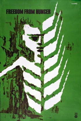
This Spanish Youthship Appeal, bearing the message ‘Send them milk’ shows his genius for visual pun – a white milk bottle perfectly echoes the shape of the black bomb, a light and smiling baby’s face gazing at one, a dark, crying infant terrified by the other. Years later, in 1962, his ‘Freedom from Hunger’ poster series for the UN would turn ears of wheat into the ribs of a starving child, a juxtaposition of even greater and more startling economy.
This Spanish Youthship Appeal, bearing the message ‘Send them milk’ shows his genius for visual pun – a white milk bottle perfectly echoes the shape of the black bomb, a light and smiling baby’s face gazing at one, a dark, crying infant terrified by the other. Years later, in 1962, his ‘Freedom from Hunger’ poster series for the UN would turn ears of wheat into the ribs of a starving child, a juxtaposition of even greater and more startling economy.
He used
an airbrush for the Spanish poster - an effect evoked by Jan Bielecki on my Hot
Key book covers - and this remained his favoured technique until the late '50s. He’d learned it in his father’s
photography studio, where his job was to touch up photographs, adding colour
tints and, well, ‘airbrushing’.
Apparently he was such a virtuoso with the tool he even used it to sign
cheques. (His father’s 1918 airbrush pencil is in the exhibition, and there
will be an airbrush demonstration at the museum on November 11th.)
Naomi Games mentioned the influence
of the 1936 Surrealist exhibition in London on her father and his contemporaries. You can see it, for example, in the
transformation of the Houses of Parliament into a writing hand casting a vote,
in a wartime poster designed to encourage the armed services to perform their
civic duties too: ‘Serve as a soldier, vote as a citizen.’ Hands and faces appear frequently in Games’
posters; they are, after all, invaluably expressive devices. Call me monothematic, but it struck me that there
was another obvious influence on Games - the poster art of the Spanish Civil
War. Designed for a largely illiterate
population, these images also often feature hands and faces, and rely on the
briefest of texts for their effect.
Their bright colours and modern graphic style had an enormous impact on
British volunteers, including Orwell, who arrived in Barcelona in December
1936 and wrote in Homage to Catalonia
of the revolutionary posters that ‘were everywhere, flaming from the walls in
clean reds and blues that made the few remaining advertisements look like daubs
of mud.’ There’s
an excellent collection in the Imperial War Museum in London, which also houses
some of Games’ best work, and you can see and find out about the Southworth
Collection in this brilliant online exhibition, The Visual Front.

This poster asks for donations to protect the
orphaned children of anti-fascists, while below, a collage of fists, factory and fighter plane exhorts competitions at work to
spur on industrial production to help the Republican war effort.

The only person in British army
history ever to have the title ‘Official War Poster Artist’, Games' persuasive visual shorthand was exceptional. He made over 100 posters, conveying exactly the kind of messages that make twelve-year-old Ernest so anxious in my novel, That Burning Summer. When Games began infantry service in 1940 he was horrified by the dull, monochrome and ineffectual information posters he saw plastered on the
walls of army barracks. Soon he was able to replace them with colourful, succinct, emotional appeals about health, cleanliness, pilfering,
rumour and countless other aspects of wartime life.

Several of Games’ designs were
rejected for being ‘too Soviet’. A few brought him into open clashes with the
authorities. Bevin actually ripped one off the wall of a public exhibition. The text was patriotic enough: ‘Your Britain … fight for it now’. But the image clearly stated that it was the new progressive Britain, embodied in modern public architecture, that was worth fighting for, not the old, socially divided nation, which Games represented by a child with rickets in a lightless city slum. Churchill banned
the poster, calling it a “Disgraceful libel on the conditions prevailing in Great
Britain before the war… the soldiers know their homes aren’t like that”; his lack
of recognition of the real conditions facing returning soldiers no doubt
helped him lose the 1945 election. Now malnutrition
and poverty is bringing rickets back into Britain’s GP surgeries while the pioneering
Lubetkin-designed Finsbury Health Centre shown in the poster has recently fought
off demolition threats. The image has
acquired new resonance.

Games’ brain seemed to work in
slogans; the texts he wrote himself were as minimalistic as his
images. ‘I am not an artist. I am a graphic thinker,’ he said. ‘The harder
I work, the simpler it looks.’ It was
only when he began to work for London Transport that he realised his ambition
of an entirely word-free poster. But
even so, as Naomi Games discovered when she began to scrutinize her father’s
work with a magnifying glass, he managed to hide lettering in almost all his
posters, quietly and lovingly scattering everywhere the initials of his wife,
his children, and even his lover.
‘It is permissible to break all the rules…but only
successfully.’ This statement from Over my shoulder, a book in which Games
set out his professional philosophy, is reproduced on one of the museum’s
walls. Like so many of Games’ working rules,
it has application far beyond the field of graphic design. He always had to balance work for the causes
in which he believed with work for commercial clients, like Guinness, the
Financial Times, BOAC and the Jersey Tourist Board. For this last commission he was asked if he
could ‘do’ a girl in a bikini on a beach. Yes, he replied, and went away to
produce his playful and prize-winning designs in which the letter ‘J’ is transformed
into deckchairs, shells and sticks of rock.
‘What happened to the girl in the bikini?’ they asked. ‘I said I could do it. I didn’t say I would.’
I laughed when I saw his comment: ‘I do my best work for Jewish
causes, and they give me most trouble.’
I wanted to cheer when I read, in Over
My Shoulder, ‘We have seen the results of the sell-out to the client on a
grand scale in Nazi Germany, in other dictatorships, and in Russia and the
satellite countries, where designers are held under rigid control. A designer must therefore be convinced that
what he is doing is right, not only for himself but for his fellow men.’ (Some things are too important to reduce to a
slogan.) An autodidact whose old school
report stated that he was ‘weak’ at drawing, Games didn’t believe in art
schools. Yet for seven years he taught
one day a week at the Royal College of Art, where another set of initials
provided another working maxim. A
designer has to work with the ‘three cs’ he told his students – Curiosity, Courage
and Concentration. But don’t forget the
Cash and the Cheques, Games would add, ever the idealistic pragmatist.

All Games posters © Estate of Abram Games
7 comments:
Lydia, what a brilliant post! I knew nothing of Games, though I recognise the Festival poster. This is an excellent introduction. (He seems to have an admirable attitude!)
‘It is permissible to break all the rules…but only successfully.’
and
"Curiosity, Courage and Concentration"
Fabulous!
This is fascinating, Lydia. The posters are so clever. Several are familiar, though not the lovely tiger at the end. I remember being taken to the Festival of Britain when I was seven. But I never knew who had designed these posters, and never had the chance to look so closely at them before. (I've also been admiring the smock his mum made for him.)
Very glad you liked it! And his mother also made him special 'arm gaiters' to keep his cuffs clean.
Thank you for this, knew the art but not the artist - very interesting.
Wonderful and fascinating
Just about the left-facing profiles - I used to draw people a lot - still do, in doodles - and if they're in profile, they always face left. Don't know why - perhaps left-handed people draw them the other way?
Post a Comment